
The Hidden Regressive Tax
Monetary expansion, asset prices and the asset-poor in the United States, 2000 to 2026
Felix Prehn · September 2026
About this report
This report examines the relationship between the expansion of the US money supply and the Federal Reserve balance sheet since 2000, the behaviour of consumer prices and asset prices over the same period, and the distribution of the resulting gains and losses across American households. It argues that the combined effect operates as a tax that no legislature has enacted and for which no household receives a bill, and that its burden falls most heavily on households that own few assets.
All figures are drawn from public sources, principally the Federal Reserve Economic Data service (FRED) of the Federal Reserve Bank of St. Louis, the Federal Reserve’s Distributional Financial Accounts, the Bureau of Labor Statistics and the Bureau of Economic Analysis. Market prices for the S&P 500 and COMEX gold futures are monthly closes from Yahoo Finance. Data were retrieved on 25 September 2026. Every number in the text can be traced to a series listed in the data appendix, and the calculation scripts are available on request.
Keywords monetary expansion, quantitative easing, Federal Reserve balance sheet, asset prices, wealth inequality, inflation tax, Distributional Financial Accounts, regressive taxation, United States
1 Introduction
In 2000 the United States had a money stock (M2) of $4.7 trillion and a Federal Reserve balance sheet of under $1 trillion. In August 2026 M2 stood at $23.3 trillion, and in September 2026 the Federal Reserve held $6.7 trillion of assets, down from a peak of $9.0 trillion in 2022. The scale of monetary expansion over one generation is without parallel in the country’s peacetime history.
The public debate about this expansion has concentrated on consumer prices. For most of the period that debate was quiet, because the consumer price index rose slowly: about 2 per cent a year until 2020. It became loud after 2021, when the CPI rose 27 per cent in five and a half years and food and rent rose faster still. The question addressed here is broader than either phase. It concerns where newly created money went, what it did to the prices of the things that money buys, and who gained and who lost as a result.
The answer developed in this report is that money creation on this scale operates as a tax, and a regressive one. It is a tax because it transfers real resources from one group of households to another without their consent. It is regressive because the transfer runs from households whose economic position consists of wages, cash and rented housing to households whose position consists of shares, property and other claims on future income. It is hidden because it appears in no budget and on no pay slip. The households that pay it see only that prices are higher and that assets they might once have bought are further out of reach.
This is not a new idea. Economists have described inflation as a regressive consumption tax for decades [1, 2], and recent work on administrative data finds that the gains from expansionary monetary policy rise monotonically with income [3]. What is new is the quantity and quality of data on the distribution of wealth in the United States. Since 2019 the Federal Reserve has published the Distributional Financial Accounts, a quarterly reconstruction of the balance sheet of each wealth group from the top 1 per cent to the bottom 50 per cent, going back to 1989 [7]. Combined with the standard price and monetary series, these accounts make it possible to measure, rather than assert, who captured the gains from a quarter century of monetary expansion.
The report proceeds as follows. Section 2 sets out how money creation reaches prices, and why asset prices respond before consumer prices. Section 3 presents the record from 2000 to 2026, both cumulatively and by episode. Section 4 examines who owns the assets whose prices rose. Section 5 measures who captured the increase in wealth. Section 6 develops the tax analogy and its incidence. Section 7 states the limits of the evidence and the main objections. Section 8 sets out implications for measurement and public understanding. A data appendix lists every series used.
2 How money creation reaches prices
2.1 Two kinds of money creation
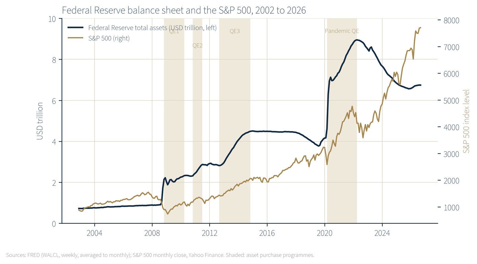
Two distinct processes expanded the quantity of money after 2008. The first is the Federal Reserve’s purchase of Treasury and mortgage-backed securities from the financial system, paid for with newly created bank reserves. This raised the monetary base (currency plus reserves) from $0.8 trillion in August 2008 to a peak of $6.4 trillion in December 2021. The second is the growth of bank deposits, whether through bank lending or through government spending financed by central bank purchases. This raised M2, the broad measure of money held by households and firms.
The two moved together in the acute phases. When the Treasury borrowed and spent in 2020 and 2021 and the Federal Reserve bought most of the resulting debt, the proceeds landed in private deposits: M2 rose 41 per cent in twenty-five months. In the 2008 to 2014 programmes the link was weaker. Much of the newly created base sat as excess reserves at the Federal Reserve, and M2 grew at 49 per cent over six years, about 7 per cent a year. Both episodes nonetheless share a feature that matters for this report: the first recipients of the new money were the sellers of financial assets, and the first prices to respond were the prices of those assets.
2.2 Why asset prices move first
Four channels connect central bank purchases to asset prices. The first is the portfolio balance effect: when the central bank removes several trillion dollars of safe bonds from private hands, the sellers must hold something else, and their search for yield lifts the price of whatever they buy next, whether corporate bonds or shares. The second is the discount rate: a lower expected path for interest rates raises the present value of any stream of future income, and long-duration assets such as growth stocks and housing respond most. The third is collateral and credit: higher asset prices raise the borrowing capacity of those who already own assets, which finances further purchases. The fourth is the signalling of a policy floor, which lowers the premium investors demand for holding risk.
Each of these channels acts on the owners of existing assets. None of them acts directly on the wages of a warehouse worker or the deposit account of a retired teacher. Consumer prices respond later and more weakly, through the slower routes of higher demand, tighter labour markets and the pass-through of asset costs (above all housing) into rents. The lag between the two responses is the source of the distributional effect. During the lag, asset owners have already gained, and non-owners have not yet lost. When consumer prices catch up, non-owners lose and asset owners are cushioned by the gains they have already booked.
2.3 The consumer price index understates the cost of the shift
Two features of the CPI are relevant. First, it measures the cost of consumption, not the cost of acquiring assets. A doubling of house prices enters the CPI only through rents and owners’ equivalent rent, which rose 147 per cent and 125 per cent respectively between 2000 and 2026, while the Case-Shiller national house price index rose 237 per cent. A household saving for a first home experiences the 237 per cent, not the 125 per cent. Second, the index is a national average weighted by the spending of all households. It does not reflect the fact that lower-income households spend a larger share of income on food, energy and rent, each of which rose faster than the headline index over long stretches of the period. These are well known properties of the index rather than flaws, but they mean that the official inflation figure is a lower bound on the burden experienced by the asset-poor.
3 The record, 2000 to 2026
3.1 Cumulative changes
Table 1 sets out the change in the main monetary, price, wage and asset series from January 2000 to the latest available observation. Figure 1 plots the same series as indices on a logarithmic scale.
| Series | Change, % | Latest |
|---|---|---|
| Money | ||
| M2 money stock | +395 | Aug 2026 |
| Monetary base | +812 | Jun 2026 |
| Consumer prices and incomes | ||
| Consumer price index, all items | +96 | Aug 2026 |
| CPI, food | +111 | Aug 2026 |
| CPI, energy | +178 | Aug 2026 |
| CPI, rent of primary residence | +147 | Aug 2026 |
| CPI, owners’ equivalent rent | +125 | Aug 2026 |
| Average hourly earnings, production and non-supervisory workers | +136 | Aug 2026 |
| Median household income, nominal (2000 to 2025) | +108 | 2025 |
| Median household income, real (2000 to 2025) | +19 | 2025 |
| Median weekly earnings, real (2000 Q1 to 2026 Q2) | +13 | 2026 Q2 |
| Asset prices | ||
| Case-Shiller national house price index | +237 | Jun 2026 |
| S&P 500 (monthly close) | +438 | Sep 2026 |
| Gold, COMEX front-month futures (from August 2000) | +1,351 | Sep 2026 |
Source: FRED series M2SL, BOGMBASE, CPIAUCSL, CPIUFDSL, CPIENGSL, CUSR0000SEHA, CUSR0000SEHC, AHETPI, MEHOINUSA646N, MEHOINUSA672N, LES1252881600Q, CSUSHPINSA; Yahoo Finance for S&P 500 and gold futures. Author’s calculations.
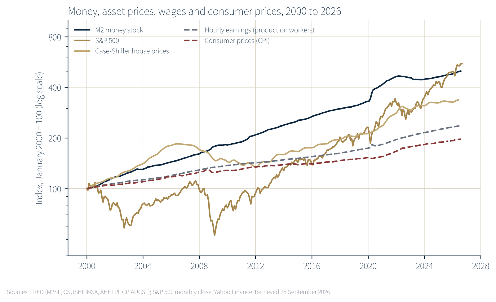
Three features of the table stand out. First, the gap between money and consumer prices is large: M2 rose four times as fast as the CPI. In the quantity theory of money, that gap must be absorbed by some combination of higher real output, lower velocity and higher prices of things outside the consumer basket. Nominal GDP rose 225 per cent between the first quarter of 2000 and the second quarter of 2026, well short of 395 per cent, so a substantial part of the gap went to the last two categories, and the lower rows of the table show where. Second, wages did better than consumer prices but far worse than assets. A production worker’s hourly pay bought about 20 per cent more consumer goods in 2026 than in 2000, an annual real gain of about 0.7 per cent. The same hourly pay bought about 55 per cent less of the S&P 500 and about 30 per cent less of the average American house. Third, the assets most sensitive to the discount rate and to portfolio rebalancing (shares, gold, housing) rose most. Gold is a special case, with no cash flow and a long history as a hedge against monetary debasement; its rise of over 1,300 per cent since 2000 is the market’s own verdict on the period.
3.2 Episodes
Cumulative figures blend periods of expansion with periods of restraint. Table 2 isolates four episodes: the three asset purchase programmes after the financial crisis, the period of near-zero policy rates, the pandemic programme, and the period since January 2021 in which the balance sheet has shrunk but the earlier expansion has worked through to consumer prices.
| QE1 to QE3 (Sep 2008 to Dec 2014) | Zero rates (Dec 2008 to Dec 2015) | Pandemic (Feb 2020 to Mar 2022) | Aftermath (Jan 2021 to Aug 2026) | |
|---|---|---|---|---|
| Fed total assets | +393 | +113 | +115 | −8 |
| M2 money stock | +49 | +51 | +41 | +20 |
| Consumer prices (CPI) | +8 | +12 | +11 | +27 |
| Hourly earnings, production workers | +14 | +15 | +13 | +29 |
| Case-Shiller house prices | +3 | +15 | +38 | +42 |
| S&P 500 | +77 | +126 | +53 | +107 |
| Gold futures | +35 | +20 | +25 | +143 |
Source: FRED series WALCL, M2SL, CPIAUCSL, AHETPI, CSUSHPINSA; Yahoo Finance. Fed total assets measured at the nearest weekly observation to the month shown. Author’s calculations.
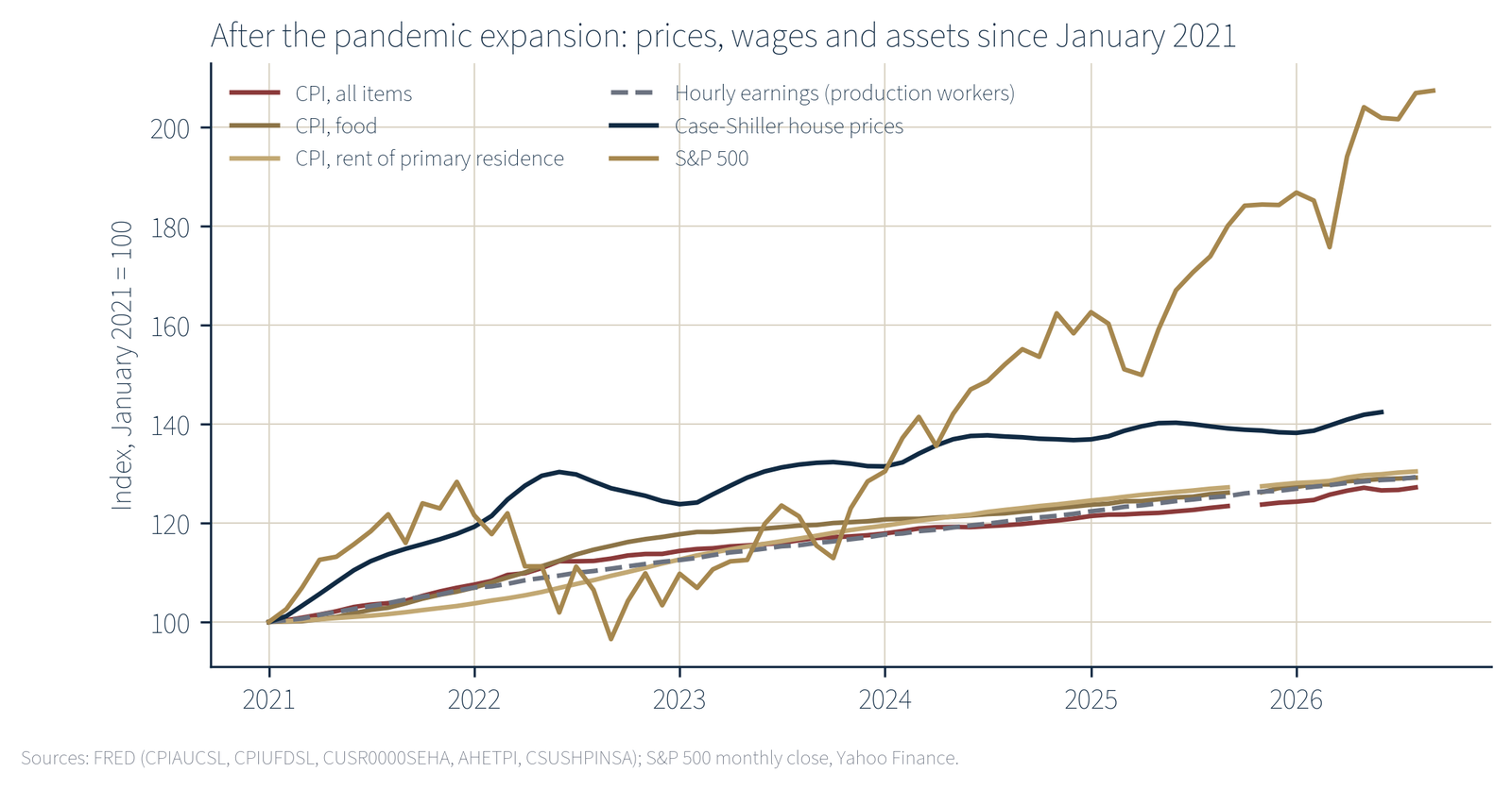
The pattern is consistent. In every expansion phase, the S&P 500 rose by a multiple of the CPI: ten times in the first programmes, ten times during zero rates, five times during the pandemic programme. House prices lagged in 2008 to 2014, when the housing market was working off the previous bubble, and led in 2020 to 2022. Wages kept pace with consumer prices in each expansion but never approached asset prices. The final column shows the delayed effect on consumer prices: from January 2021 the CPI rose 27 per cent, food 29 per cent and rent 30 per cent, while the balance sheet was shrinking. Even in this period of monetary restraint, the S&P 500 doubled and gold rose 143 per cent.
3.3 The real policy rate
The price of money, as well as its quantity, was set in favour of borrowers and asset owners for most of the period. Figure 4 shows the federal funds rate less the year-on-year change in the CPI. From December 2008 to August 2026 this real rate was negative in 148 of 212 months, with a mean of −1.0 percentage points.
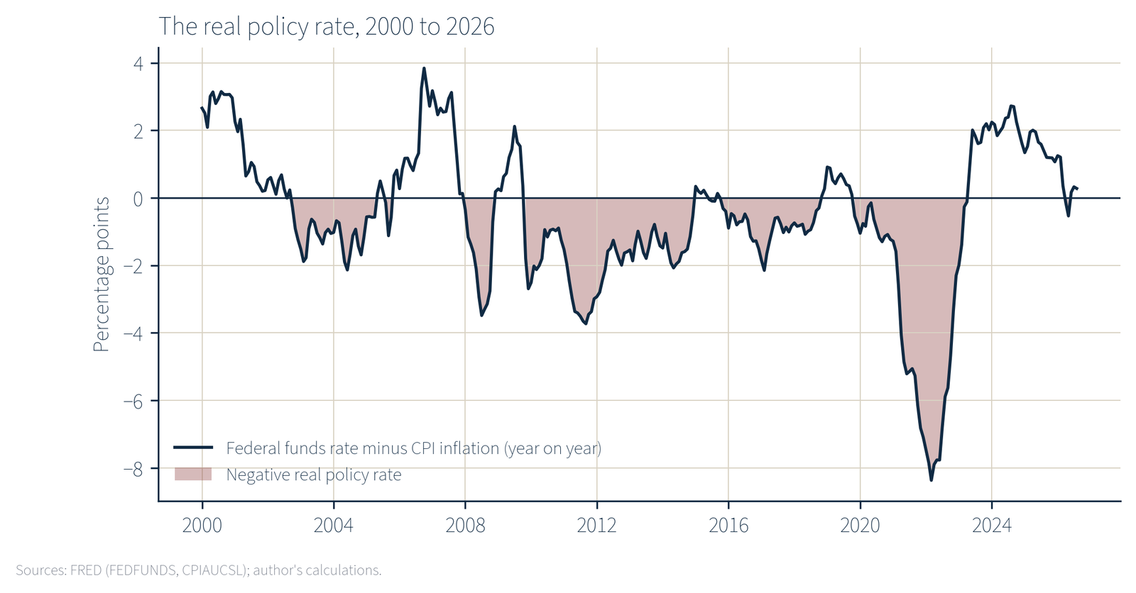
It reached −8.4 percentage points in March 2022. The policy rate was below 0.25 per cent in 109 of those months.
A negative real rate means that a household holding cash or a bank deposit loses purchasing power each year even before tax, while a household that borrows to buy an appreciating asset is paid, in real terms, to do so. The first household is disproportionately found in the lower half of the wealth distribution, the second in the upper tenth. The distributional consequence of a decade and a half of negative real rates is examined in the next two sections.
4 Who owns the assets
The Federal Reserve’s Distributional Financial Accounts divide US households into four groups by net worth: the top 1 per cent, the next 9 per cent (the 90th to 99th percentiles), the next 40 per cent (the 50th to 90th percentiles) and the bottom 50 per cent. Table 3 shows what the two ends of the distribution held in the second quarter of 2026, and Figure 5 shows the composition of their assets.
The contrast is stark. The bottom half of American households, roughly 67 million of them, hold 0.6 per cent of the nation’s corporate shares and mutual fund holdings. The top 1 per cent, roughly 1.3 million households, hold 50.9 per cent. The bottom half’s assets are two thirds housing and durable goods (cars and appliances), which depreciate or carry mortgages, and its liabilities amount to 58 per cent of its assets. The top 1 per cent’s liabilities are 2 per cent of its assets.
This matters because the four channels described in Section 2 act on financial assets first and most strongly. The S&P 500 rose 438 per cent since 2000; the bottom half owned almost none of it. House prices rose 237 per cent; the bottom half owned 9.7 per cent of the housing stock by value, much of it mortgaged, and the 35 per cent of households who rent owned none. What the bottom half did hold in quantity was cash, deposits and wage claims: precisely the instruments whose real value a negative real rate erodes.
| Bottom 50%, USD trn | Bottom 50%, % of US total | Top 1%, USD trn | Top 1%, % of US total | |
|---|---|---|---|---|
| Total assets | 10.27 | 61.50 | ||
| Real estate | 4.82 | 9.7 | 6.67 | 13.4 |
| Consumer durables | 2.17 | n/a | ||
| Corporate shares and mutual funds | 0.37 | 0.6 | 32.89 | 50.9 |
| Deposits | 0.78 | 5.5 | 3.32 | 23.4 |
| Money market funds | 0.06 | n/a | ||
| Defined contribution pensions | 0.76 | n/a | ||
| Defined benefit pension entitlements | 0.49 | n/a | ||
| Total liabilities | 5.99 | 1.19 | ||
| Home mortgages | 3.16 | n/a | ||
| Consumer credit | 2.64 | n/a | ||
| Net worth | 4.28 | 2.3 | 60.31 | 32.5 |
Source: Federal Reserve Distributional Financial Accounts via FRED (series listed in the appendix). “n/a”: not retrieved for this report. Percentage shares of the US household total as published by the Federal Reserve.
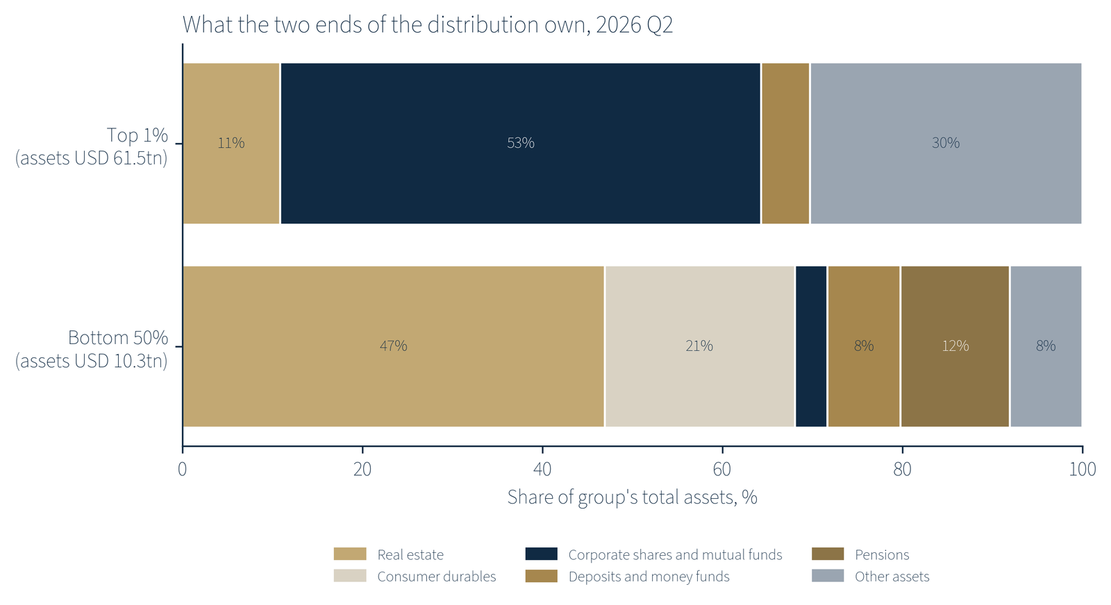
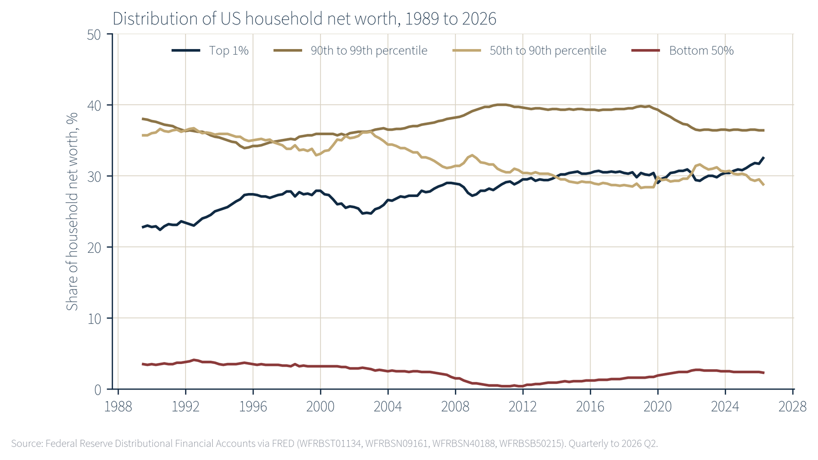
Figure 6 shows how the shares of net worth have moved since 1989. The top 1 per cent’s share rose from 22.8 per cent in 1990 to 27.9 per cent in 2000, 29.0 per cent on the eve of the pandemic, and 32.5 per cent in the second quarter of 2026. The bottom half’s share fell from 3.5 per cent in 1990 to 1.0 per cent at the end of 2008 and a low of 0.4 per cent in the fourth quarter of 2010, and had recovered only to 2.3 per cent by 2026. The middle group, the 50th to 90th percentiles, lost most in relative terms, from 36.0 per cent to 28.8 per cent, largely because their wealth is concentrated in housing, which rose less than shares.
Survey data point the same way. The Federal Reserve’s 2022 Survey of Consumer Finances found that 21 per cent of families held stock directly, up from 15 per cent in 2019, and that 66 per cent owned their main residence [6]. Ownership through retirement accounts is broader, but the amounts held by families in the lower half of the income distribution are small relative to their income and to the holdings of the top decile. For the purpose of this report the precise ownership rate matters less than the amounts: whatever the proportion of the bottom half that holds some shares, it holds 0.6 per cent of the total.
5 Who captured the gains
The Distributional Financial Accounts allow the change in net worth over any period to be allocated across the four wealth groups. Table 4 does this for the whole period since 2000, for the 2008 to 2014 purchase programmes, and for the pandemic expansion and its aftermath. Figure 7 plots the shares against each group’s share of households.
| Top 1% | 90th to 99th | 50th to 90th | Bottom 50% | |
|---|---|---|---|---|
| Share of households, % | 1 | 9 | 40 | 50 |
| 2000 Q1 to 2026 Q2 (total increase $143.6 trillion) | ||||
| Increase, $ trillion | 48.6 | 52.5 | 39.5 | 2.9 |
| Share of increase, % | 33.9 | 36.6 | 27.5 | 2.0 |
| Increase per household, approx. | $36.1m | $4.3m | $733k | $43k |
| 2008 Q4 to 2014 Q4, QE1 to QE3 (total increase $23.3 trillion) | ||||
| Increase, $ trillion | 8.7 | 9.5 | 4.9 | 0.25 |
| Share of increase, % | 37.3 | 40.6 | 21.0 | 1.1 |
| Increase per household, approx. | $6.5m | $782k | $91k | $3.7k |
| of which real estate, $ trillion | +0.54 | +0.46 | +0.12 | −0.49 |
| 2020 Q1 to 2026 Q2 (total increase $83.9 trillion) | ||||
| Increase, $ trillion | 30.8 | 27.6 | 23.1 | 2.3 |
| Share of increase, % | 36.7 | 32.9 | 27.5 | 2.8 |
| Increase per household, approx. | $22.8m | $2.3m | $428k | $35k |
| of which corporate shares, $ trillion | 21.7 | 16.0 | 4.8 | 0.25 |
| of which real estate, $ trillion | 2.4 | 6.1 | 10.4 | 1.4 |
Source: Federal Reserve Distributional Financial Accounts via FRED; author’s calculations. Nominal values. Per-household figures divide each group’s increase by its share of the 134.8 million US households recorded for 2025 and are approximate.
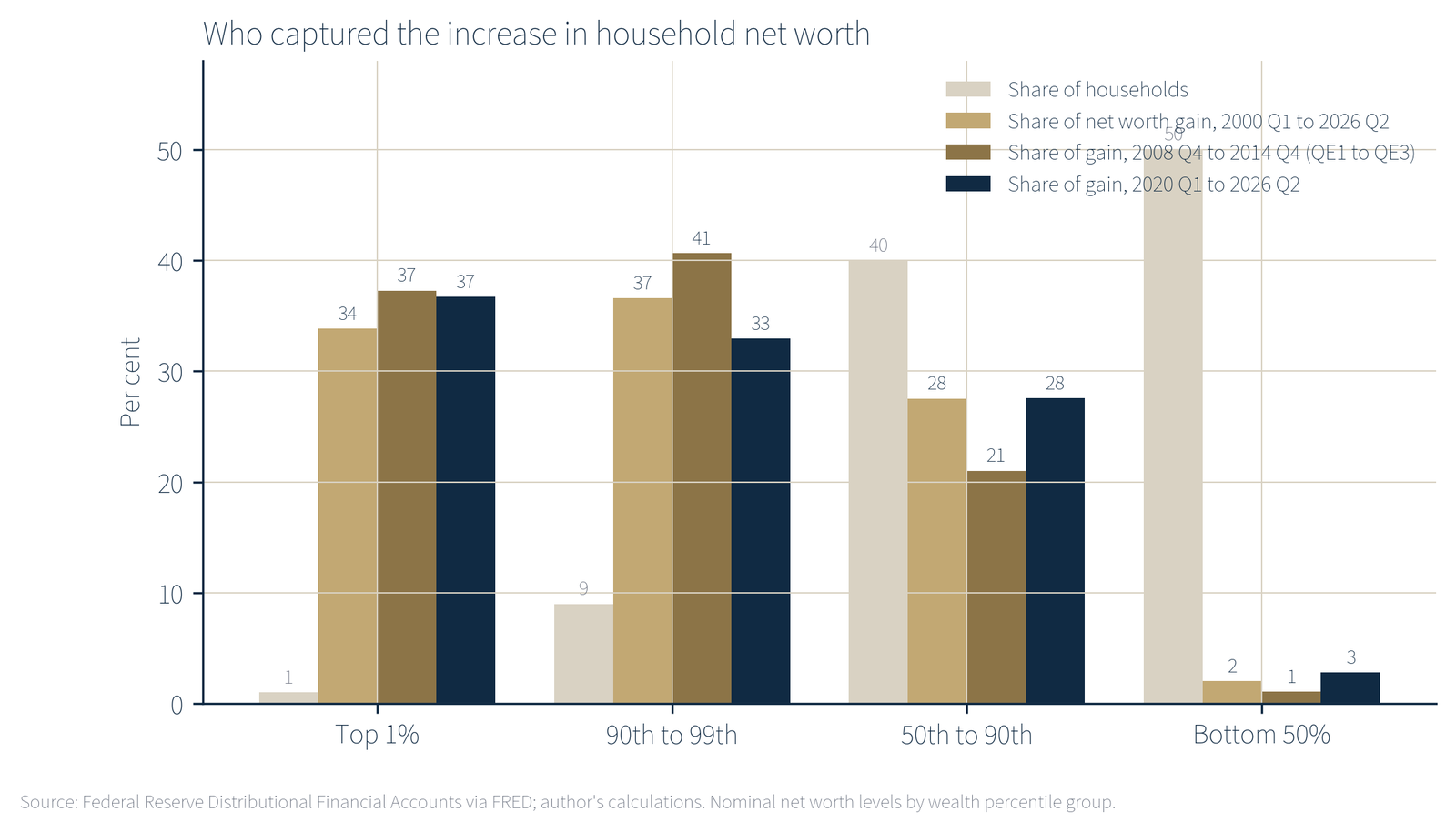
Three observations follow. First, the ordering is identical in every period: the top 1 per cent and the next 9 per cent each captured a third or more of the gain, the middle 40 per cent captured a fifth to a quarter, and the bottom half captured between 1 and 3 per cent. Second, the bottom half’s share of the gain was lowest, at 1.1 per cent, during the 2008 to 2014 programmes, the period in which the monetary expansion was purest (no large fiscal transfers, no supply shock). Its real estate wealth fell by $0.49 trillion in those years while the top 10 per cent’s rose. The programmes designed to support asset prices did so, and the bottom half owned too few assets to benefit. Third, in the pandemic period the bottom half’s share rose to 2.8 per cent, above its long-run average. This reflects direct fiscal transfers, a tight labour market and a housing boom that reached the minority of the bottom half who own homes. Even so, the top 1 per cent gained $30.8 trillion, of which $21.7 trillion came from corporate shares alone; the bottom half’s entire gain was $2.3 trillion.
In percentage terms the bottom half’s net worth rose faster than any other group’s between 2020 and 2026, by 122 per cent against 104 per cent for the top 1 per cent. That figure is sometimes cited as evidence that the period was equalising. It is arithmetically true and economically misleading. The bottom half started from $1.9 trillion, or about $29,000 per household, and a doubling of so small a base remains a small amount. A household in the bottom half gained roughly $35,000 over six years; a household in the top 1 per cent gained roughly $22.8 million. Measured by share of the total, the top 1 per cent’s position improved (from 29.0 to 32.5 per cent of net worth) and the bottom half’s barely moved (from 1.9 to 2.3 per cent).
6 The tax analogy and its incidence
6.1 Three components of the levy
A tax is a compulsory transfer of real resources from private parties to the state, or, through the state, to other private parties. Monetary expansion satisfies this definition in three ways, each of which weighs more heavily on the asset-poor.
The inflation tax on money and wages
Anyone who holds a dollar while the price level rises pays a levy equal to the rise. The classical literature calls this seigniorage or the inflation tax [1]. Since January 2021 the CPI has risen 27 per cent. Applied to the $735 billion of deposits the bottom half held in January 2021, that is a loss of roughly $200 billion of purchasing power, or about $3,000 per household, incurred without any transaction. Applied to the whole M2 money stock of $19.4 trillion at that date, it is about $4.1 trillion. The loss falls on whoever holds money, but its weight in each household’s position varies enormously. For the bottom half, deposits and cash are among the few liquid assets they hold; for the top 1 per cent, deposits are 5 per cent of assets and shares are 53 per cent. Wages are subject to the same erosion with a lag; hourly earnings of production workers did keep pace with the CPI over the period since 2021 (29 per cent against 27 per cent), but not with rent (30 per cent), and not remotely with the assets the same workers would need to buy to escape renting.
The entry price of assets
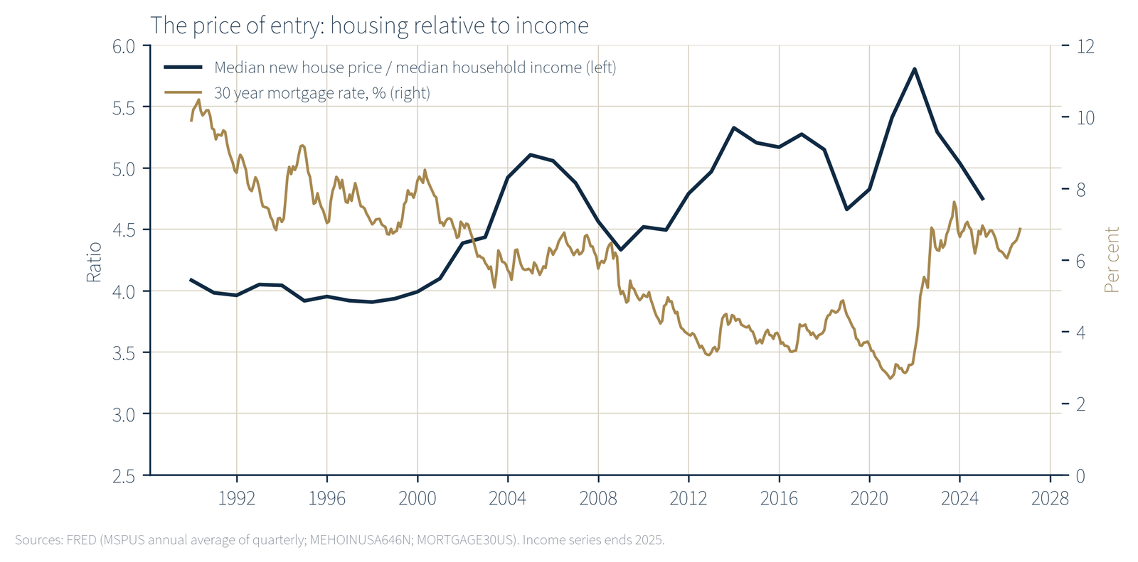
The second component is the rise in the price of assets relative to the income needed to buy them. The median new house sold in the United States cost 3.9 times median household income in 2000; in 2024 it cost 5.0 times, and in 2025, after prices eased, 4.7 times (Figure 8). The median new house price rose from $165,300 in the first quarter of 2000 to a peak of $442,600 in the fourth quarter of 2022 and stood at $410,700 in the second quarter of 2026, with a 30 year mortgage rate of 7.0 per cent. A household that did not own a home in 2000 and saved a fixed share of a median wage for a deposit has been chasing a target that moved away faster than it could save.
Recent work by Fagereng, Gomez, Gouin-Bonenfant, Holm, Moll and Natvik makes the point precisely: the welfare effect of an asset price change on a household depends not on its holdings but on its planned net purchases [5]. A young household that intends to buy a home and build a pension is a net buyer of assets and is made worse off when their prices rise, however the national accounts record it. An older or wealthier household that intends to sell assets to fund consumption is made better off. Asset price inflation therefore redistributes from the young to the old and from the asset-poor to the asset-rich, and the size of the transfer rises with the size of the price move. On Fagereng and co-authors’ estimates for Norway, the gains at the top were large; the direction of the effect is general.
The absence of an offsetting gain
The third component is simply the other side of Section 5. The household that pays the inflation tax on its deposits and faces a higher entry price for a home receives, if it holds no assets, no compensating capital gain. The household that holds assets pays the same inflation tax on its cash but receives a gain on its holdings that is many times larger. For the top 1 per cent between 2020 and 2026, the gain on shares alone ($21.7 trillion) was roughly 25 times the purchasing power lost on the group’s deposits ($3.2 trillion of deposits in the first quarter of 2021, eroded by 27 per cent).
6.2 Incidence across the distribution
Table 5 assembles the incidence of the three components across the four wealth groups, using the 2020 Q1 to 2026 Q2 period. It is a stylised account; the deposit figures for the middle groups are approximate and the exposure to rent is drawn from the CPI, which does not report by wealth group. But the direction in every row is the same.
| Top 1% | 90th to 99th | 50th to 90th | Bottom 50% | |
|---|---|---|---|---|
| Share of corporate shares held, 2026 Q2 | 50.9% | 48.5% combined | 0.6% | |
| Share of deposits held, 2026 Q2 | 23.4% | 71.1% combined | 5.5% | |
| Deposits as share of own assets | 5% | n/a | 8% | |
| Housing and durables as share of own assets | 11% | n/a | 68% | |
| Liabilities as share of own assets | 2% | n/a | 58% | |
| Share of net worth gain | 36.7% | 32.9% | 27.5% | 2.8% |
| Gain per household, approx. | $22.8m | $2.3m | $428k | $35k |
| Gain per household as multiple of median household income (2025) | 261 | 26 | 4.9 | 0.4 |
Source: Federal Reserve Distributional Financial Accounts via FRED; US Census median household income 2025 ($87,460) via FRED; author’s calculations. Combined figures for the 50th to 99th percentiles are residuals from the published top 1% and bottom 50% shares.
A progressive tax takes a rising share of resources as resources rise. The levy described here does the reverse. The bottom half of households received a gain equal to about five months of median income over six years; the top 1 per cent received a gain equal to over two and a half centuries of it. Expressed as a share of the group’s own starting position, the gain is large for both. Expressed against the cost of living, which is what determines whether a household can buy a house or fund a retirement, the bottom half’s gain is negligible and the top’s changes what the household can do.
6.3 Why the levy is hidden
Conventional taxes are visible in three ways: they are enacted by a legislature, their rate is published, and the payer receives a record. The monetary levy has none of these properties. The Federal Reserve’s purchase decisions are made by a committee of twelve, published as a policy statement, and never described as a transfer between households. There is no rate; the size of the transfer emerges after the fact from the movement of prices. And there is no record: the household whose deposits lost 27 per cent of their purchasing power receives no statement to that effect, and the household whose shares doubled pays no tax on the gain until it sells, if it ever does.
The invisibility is not incidental. A legislated transfer of $30.8 trillion to the top 1 per cent of households over six years would not pass any legislature. The same transfer, effected through asset prices, passed without a vote, and is defended as the side effect of policies aimed at employment and price stability. Whether or not those aims justified the means, the distributional result is a matter of record, and it ought to be recorded as such.
7 Objections and limits
The argument set out above is stronger in some places than in others. The following objections are the ones the author considers most serious.
Correlation is not causation
The tables in Section 3 show co-movement between money creation and asset prices, not proof that the first caused the second. Share prices also rose because corporate earnings rose, because technology firms grew, and because global savings sought a home in US markets. House prices also rose because supply was constrained. Two responses apply. First, the mechanisms in Section 2 are the ones the Federal Reserve itself has cited as the intended channels of its purchases; the policy was designed to raise asset prices, and it would be odd to credit it with success in the labour market while denying it any effect on the asset market. Second, the distributional argument does not depend on the share of the asset price rise that was monetary.
Whatever the cause of the rise, the bottom half owned 0.6 per cent of the shares.
The pandemic inflation was a supply shock and a fiscal event
Much of the 2021 to 2023 inflation reflected disrupted supply chains, energy prices after February 2022, and pandemic fiscal legislation of roughly $5 trillion. The Federal Reserve financed a large part of those transfers by buying the debt, and the M2 figures in Table 2 record the result, but the report does not claim that monetary policy alone caused the price rise. It claims that the combined operation transferred wealth in the direction described, and that the monetary component was large.
Real incomes rose
Real median household income rose 19 per cent between 2000 and 2025 and the real hourly earnings of production workers rose 20 per cent. The asset-poor are better off in consumption terms than in 2000. This is true and important, and it is why the report describes a regressive tax rather than an absolute impoverishment. A regressive tax does not make its payers poorer than before; it takes a larger share from them than from the rich. The comparison that matters is between the 20 per cent real gain in wages and the 237 per cent nominal (roughly 70 per cent real) gain in house prices, or the 438 per cent nominal (roughly 175 per cent real) gain in the S&P 500.
Rents are sticky and cushion the poor
Pallotti and co-authors find, for the euro area in 2021 and 2022, that low-income tenants were partly protected because rents adjust slowly [4]. The US CPI rent index rose 30 per cent between January 2021 and August 2026, marginally more than the all-items index, so the cushion was thin and temporary. Over the longer period from 2000 the rent index rose 147 per cent against 96 per cent for all items.
The middle 40 per cent did gain, mainly through housing
Between 2020 and 2026 the 50th to 90th percentiles gained $23.1 trillion, of which $10.4 trillion was real estate. Homeownership stood at 65 per cent in 2026, so a majority of American households did hold the one asset that reached the middle of the distribution. The report’s claim is about the bottom half and about the shape of the distribution, not about a median household with a mortgage, which was a net beneficiary of the housing component. The record of the 2008 to 2014 programmes also bears on this point: those programmes, the cleanest monetary episode, produced a loss of housing wealth for the bottom half and only a 21 per cent share of the gain for the middle 40 per cent, well below their 40 per cent share of households.
Data limitations
The Distributional Financial Accounts are a model-based reconstruction that combines the Survey of Consumer Finances with the aggregate Financial Accounts; they are revised and carry sampling uncertainty at the top of the distribution. Per-household figures in this report divide group totals by group shares of the 2025 household count and are approximate to within a few per cent. The Case-Shiller index measures repeat sales of existing homes and the median new house price measures a different segment of the market; both are used where appropriate and labelled. Gold prices are COMEX front-month futures rather than spot. The report uses the CPI rather than the PCE deflator throughout; the PCE rose less over the period, which would slightly reduce the inflation tax figures and slightly increase the real gains.
Alternative policies might have been worse
It is possible that without asset purchases in 2008 and 2020 unemployment would have been higher for longer, and that the bottom half would have lost more in wages than it failed to gain in assets. This report does not attempt a counterfactual and does not argue that the policies should not have been adopted. It argues that their distributional cost was large and unrecorded, and that a policy whose cost is unrecorded is unlikely to be weighed correctly.
8 Implications
The Prehn Institute does not give financial advice and this section contains none. The implications drawn here concern measurement and public understanding.
Record the transfer. The Federal Reserve publishes the Distributional Financial Accounts quarterly. It does not publish, alongside its policy statements, an estimate of the distributional effect of its balance sheet decisions. The data to do so exist, and Table 4 shows what such an estimate would look like. A central bank that reports the effect of its actions on employment and consumer prices could report their effect on the distribution of wealth with no new data collection.
Measure the cost of assets, not only the cost of consumption. The CPI is a consumption index and was never designed to capture the cost of acquiring a home or a pension. A published index of the cost of asset acquisition relative to median income, of the kind shown in Figure 8, would make visible the burden that the CPI omits. Several such measures exist in academic work; none is official.
Name the mechanism. Public discussion of inflation in 2021 to 2023 concentrated on the prices of groceries and petrol. Those prices matter, and they rose. But the larger transfer, in dollar terms, took place over the preceding decade in the prices of shares and houses, when the CPI was quiet and the policy was described as a success. A vocabulary that distinguishes consumer price inflation from asset price inflation, and that recognises both as consequences of monetary expansion, would allow the public to understand what was done and who paid.
Hold the data to the same standard as the policy. Every figure in this report is drawn from official sources that any reader can retrieve. The conclusion that the bottom half of American households captured 2 per cent of a $144 trillion increase in wealth over a quarter century of monetary expansion is a matter of arithmetic rather than interpretation. What follows from it is a matter for public debate, and that debate should start from the numbers.
Data appendix
All FRED series were retrieved from the Federal Reserve Bank of St. Louis on 25 September 2026. Monthly changes use the observation for the month stated; quarterly series are dated by the first month of the quarter; weekly series (WALCL, MORTGAGE30US) use the nearest observation. Percentage changes are (xₜ/x₀ − 1) × 100. Real series deflate by CPIAUCSL unless FRED publishes a real series (MEHOINUSA672N, LES1252881600Q).
| FRED ID | Series | Latest used |
|---|---|---|
| WALCL | Federal Reserve total assets, weekly, $ million | 23 Sep 2026 |
| TREAST, WSHOMCB, WRESBAL | Fed holdings of Treasuries, MBS; reserve balances | Sep 2026 |
| BOGMBASE | Monetary base, $ million | Jun 2026 |
| M2SL | M2 money stock, $ billion, seasonally adjusted | Aug 2026 |
| FEDFUNDS, IORB | Effective federal funds rate; interest on reserve balances | Aug/Sep 2026 |
| DGS10 | 10 year Treasury constant maturity yield | Sep 2026 |
| CPIAUCSL | CPI, all urban consumers, all items, SA | Aug 2026 |
| CPILFESL, CPIUFDSL, CPIENGSL | CPI less food and energy; food; energy | Aug 2026 |
| CUSR0000SEHA, CUSR0000SEHC | CPI rent of primary residence; owners’ equivalent rent | Aug 2026 |
| PCEPI | PCE price index | Aug 2026 |
| CSUSHPINSA | S&P CoreLogic Case-Shiller US national home price index, NSA | Jun 2026 |
| MSPUS | Median sales price of new houses sold, quarterly | 2026 Q2 |
| MEHOINUSA646N, MEHOINUSA672N | Median household income, nominal and real (2025 dollars) | 2025 |
| LES1252881600Q | Median usual weekly real earnings, full-time wage and salary workers | 2026 Q2 |
| AHETPI | Average hourly earnings, production and non-supervisory employees | Aug 2026 |
| RHORUSQ156N | Homeownership rate | 2026 Q2 |
| MORTGAGE30US | 30 year fixed mortgage rate, weekly | Sep 2026 |
| TTLHH | Total households (Census) | 2025 |
| A091RC1Q027SBEA, FYOINT | Federal interest payments (quarterly; fiscal year) | 2026 / FY2025 |
| WFRBST01134, WFRBSN09161, WFRBSN40188, WFRBSB50215 | Share of net worth: top 1%, 90th to 99th, 50th to 90th, bottom 50% | 2026 Q2 |
| WFRBLT01026, WFRBLN09053, WFRBLN40080, WFRBLB50107 | Net worth levels by group, $ million | 2026 Q2 |
| WFRBLT01014, WFRBLN09041, WFRBLN40068, WFRBLB50095 | Corporate equities and mutual fund shares by group | 2026 Q2 |
| WFRBST01122, WFRBSB50203 | Share of corporate equities: top 1%, bottom 50% | 2026 Q2 |
| WFRBLT01002, WFRBLN09029, WFRBLN40056, WFRBLB50083 | Real estate by group | 2026 Q2 |
| WFRBST01110, WFRBSB50191 | Share of real estate: top 1%, bottom 50% | 2026 Q2 |
| WFRBLB50081, WFRBLB50084, WFRBLB50088 | Bottom 50%: total assets; consumer durables; money market funds | 2026 Q2 |
| WFRBLDCPB50, WFRBLDBPB50 | Bottom 50%: DC pension entitlements; DB pension entitlements | 2026 Q2 |
| WFRBLDEB50, WFRBLTOP1DE, WFRBSDEB50, WFRBSTOP1DE | Deposits, bottom 50% and top 1%, levels and shares | 2026 Q2 |
| WFRBLB50100, WFRBLB50102, WFRBLB50103 | Bottom 50%: total liabilities; home mortgages; consumer credit | 2026 Q2 |
| WFRBLT01000, WFRBLT01019 | Top 1%: total assets; total liabilities | 2026 Q2 |
Market data: S&P 500 index (ticker ^GSPC), monthly close, January 1999 to September 2026, Yahoo Finance. Gold, COMEX front-month futures (GC=F), monthly close, August 2000 to September 2026, Yahoo Finance. Percentage changes for September 2026 use the close on the retrieval date.
Selected levels used in the text: Fed total assets $890,662 million (26 Dec 2007), $925,725 million (10 Sep 2008), $4,497,660 million (31 Dec 2014), $8,965,487 million (13 Apr 2022, peak), $6,747,704 million (23 Sep 2026). M2 $4,666.1 billion (Jan 2000), $19,375.3 billion (Jan 2021), $23,342.8 billion (Aug 2026). CPI 169.3 (Jan 2000), 334.131 (Aug 2026); peak year-on-year rate 9.0 per cent (Jun 2022). S&P 500 1,394.46 (Jan 2000), 7,704.13 (Sep 2026). Median household income $41,990 (2000), $87,460 (2025). Households 134.79 million (2025). Bottom 50% deposits $735 billion (2021 Q1). Homeownership rate 69.2 per cent (2004 Q2 peak), 62.9 per cent (2016 trough), 65.0 per cent (2026 Q2).
References
- [1]Erosa, A. and Ventura, G. (2002). On inflation as a regressive consumption tax. Journal of Monetary Economics, 49(4), 761 to 795.
- [2]Easterly, W. and Fischer, S. (2001). Inflation and the poor. Journal of Money, Credit and Banking, 33(2), 160 to 178.
- [3]Andersen, A. L., Johannesen, N., Jørgensen, M. and Peydró, J.-L. (2023). Monetary policy and inequality. Journal of Finance, 78(5).
- [4]Pallotti, F., Paz-Pardo, G., Slacalek, J., Tristani, O. and Violante, G. L. (2024). Who bears the costs of inflation? Euro area households and the 2021 to 2023 shock. Journal of Monetary Economics.
- [5]Fagereng, A., Gomez, M., Gouin-Bonenfant, É., Holm, M., Moll, B. and Natvik, G. (2025). Asset-price redistribution. Journal of Political Economy.
- [6]Board of Governors of the Federal Reserve System (2023). Changes in U.S. Family Finances from 2019 to 2022: Evidence from the Survey of Consumer Finances. Washington, DC, October 2023.
- [7]Board of Governors of the Federal Reserve System. Distributional Financial Accounts, quarterly, 1989 Q3 to 2026 Q2, via FRED.